


.png)
20 Lead Generation Site Examples 2025
A good lead generation website isn’t just about looking nice — it’s about being built with a clear goal in mind. The right design should guide visitors step by step until they’re ready to take action.
That’s where the lead form comes in. If it’s done well, it won’t feel pushy or out of place — it’ll feel like the next obvious step. No confusion, no friction. Just a smooth path from interest to conversion.
We’ve put together the best lead gen website examples from different industries, all showing how smart design and high-performing lead forms can actually bring in real results.
20 Examples of High Converting Lead Generation Websites
We've handpicked 20 high-converting lead generation websites, showing how their forms use smart placement, compelling incentives, and friction-free design to turn visitors into leads.
1. HubSpot: Marketing and B2B/SaaS
HubSpot just makes it easy for users to sign up. Once you land on the site, you see an incentive that really makes sense — free forever software offers for filling out a simple form.
The form on the landing page provides a range of useful tools to convert visitors into organic leads by collecting information intelligently. Nothing too serious. Just simple, straightforward field requests.
The visitor is compelled to say ‘Yes’ because it seems HubSpot is offering a little more than they’re asking for.

The icing on the cake is that small text right where you can see it — ‘100% free. No credit card is needed,’ plus a comfortable option to continue with Google.
To drive traffic, HubSpot relies heavily on high-volume content marketing, SEO, and product-led acquisition funnels. The form is placed above the fold on key landing pages, making it immediately accessible once the value is clear.
Why does it work?
Free-forever model removes risk perception
Minimal form fields reduce abandonment
Google signup leverages existing trust
Creates perceived value imbalance (giving more than asking)
2. Optimizely: B2B and Content Marketing
Before you get in too deep, there's a landing page you just can't ignore. Optimizely does the big, bold, beautiful work of getting you to notice the CTA. And you do, because it leads you directly to the form.

Again, the actual form is located on the right-hand side of the page — a good strategy if you really want that extra attention from visitors.
Optimizely isn't sloppy when it comes to their lead generation form — no, no. You see how there are two columns?
It makes the form appear shorter to the eyes that it tricks visitors into thinking there are fewer questions and makes them answer the required fields without thinking twice.
Why does it work?
Bold CTA creates an immediate focal point
Right-side placement matches natural eye movement
Two-column design makes the form appear shorter
Clean color contrast enhances visibility
3. Lemonade: Insurance
Lemonade starts by asking if the visitor already has a Lemonade account. And not in the usual boring manner of most platforms, it looks like an actual quiz — inviting and super sleek.
They go on to confirm what type of insurance is needed. This is where the visitor gets a personalized, conversational message that lets them know a price quotation is coming.
But before that, the actual form begins with an easy, ongoing conversation asking for information such as name, address etc., depending on the type of insurance.

There’s even a face on the page that makes it feel like you’re really chatting with an interested person. You’re guided into the whole lead generation process one by one, but it feels like a breeze.
This eases the site visitor into giving more details about the insurance purchase. Lemonade has gone the extra mile to get to know you — with multi-step but simple forms per page.
Why does it work?
Quiz format transforms tedious forms into engaging interaction
Conversational approach mimics human dialogue, reducing resistance
Step-by-step information requests prevent overwhelm
Human face creates emotional connection and builds trust
Personalized responses make visitors feel understood
4. Calendly: Scheduling Tool
Calendly masters simplicity in lead gen. Visitors arrive on a clean, distraction-free page with a clear promise — Easy scheduling ahead. Below, a simple email form with a direct CTA — Sign up for free. No clutter, just speed.
The form starts as a single step, then unfolds into a personalized multi-step signup. After entering an email, users create a password and set preferences like availability and calendar integrations. Real-time error checks and suggestions boost user confidence.

Social proof, like mentions of Dropbox and Zendesk, is visible without being pushy. The email opt-in is subtle, giving users control.
Why does it work?
Single-field entry point minimizes initial commitment
Real-time validation prevents frustration and abandonment
Product-aligned UX reinforces brand promise of simplicity
Strategic social proof builds credibility without distraction
User control over marketing opt-in builds trust relationship
5. Shopify: E-commerce Platform
Shopify’s lead generation is sharp and purposeful. Right on the homepage, you see a bold headline — Start your free trial today — paired with a clean, single-field email form. That simplicity is no accident. Shopify knows its visitors are problem-aware, and a fast-start trial keeps friction low.

After email submission, users go through a smooth three-step signup. Each step collects key info (store type, business name, goals), using smart field logic and micro-progress bars to keep things easy.
Value props like “No credit card required” and “Trusted by millions” add trust, while strong CTAs and clear design guide users.
Why does it work?
Micro-steps prevent cognitive overload
No credit card = lower perceived risk
Optimized visual hierarchy keeps focus on conversion
Single-field initial form minimizes entry barrier
Progress indicators create commitment through small wins
6. Uber: Ride-hailing
Uber doesn’t waste time. They know they have different types of leads — those who want to start driving with Uber, those who’d like to order rides and those who just want to order delivery with Uber Eats. And they quickly make that distinction.

Even on the login page, they’ve incorporated the same tactic by separating the leads and making sure they get a personalized direction for just what they need.
Then, there’s the actual form. Uber makes its sign-up form as clean as possible by asking just one question and even giving an option to put in either an email address or a phone number.
The form doesn’t get too complicated or confusing with multiple choices.

And if the visitor is interested, our tested and trusted Google, Apple and Facebook sign-up options are right there to make things even easier.
Why does it work?
Immediate segmentation prevents confusion and enhances relevance
Single question form minimizes friction and abandonment
Email/phone number flexibility accommodates user preferences
Clean design focuses attention on conversion action
Third-party login options reduce signup barriers
7. Medium: Online Reading
No need to say much. Medium makes everything so smooth and simple.
From the website giving a really simple cue to start reading, Medium sure knows how to invite its readers and creators to dive into what they truly love.

Then it goes on to a straightforward, self-explanatory page of the tested and trusted sign-up options (socials and email).
You then have to get through the routine verification page, and you’re all set!
Plus that extra friendly reminder to come in if you are already part of the community — Sign in if you already have an account.

Why does it work?
Minimalist design creates frictionless entry point
Social sign-up options leverage existing accounts
Clear pathways for both new and returning users
Direct CTAs eliminate decision fatigue
Verification step builds community trust and quality
8. Lyft: Ride-Hailing
The Lyft lead generation form is so obvious on the website once you come in.
You can easily notice that lead distinction again — the visitor can still decide to either sign up for a ride or apply to become a driver.

By clicking on any of these options, either from the direct view on the landing page or from the menu bar, the actual form shows up.
And it gets even better because you need just one piece of information to complete the sign-up journey — a phone number.
A total no-brainer. It’s like Lyft is saying, “Sign up and get started already. What are you waiting for?!”

Why does it work?
Clear audience segmentation increases relevance
Single field (phone number) minimizes signup friction
Bold CTAs create clear conversion paths
Visual hierarchy focuses attention on primary actions
Mobile-first approach aligns with service context
9. Airbnb: Vacation Rental
Once you get into the website and proceed to the signup CTA, Airbnb asks the initial necessary question to confirm your location and phone number (because this just aligns with their hosting niche and will help to personalize suggestions in the future).
Then they show the visitor the different sign-in options on the same page to speed up the process to some extent.
This is when they go on to ask multiple questions to gather necessary information about potential hosts and capture everything they need.

Airbnb then incorporates buttons with question marks next to specific form fields that explain why Airbnb requires certain information.
This step-by-step process assures the user that this is an organized process.
The last noticeable feature is that tiny option to confirm whether or not to receive marketing messages by email. This is great UX.
Why does it work?
Location-based personalization creates relevance
Multiple login options reduce abandonment
Progressive disclosure of form fields prevents overwhelm
Explanatory tooltips justify information requests
Transparent marketing opt-in builds trust
10. Netflix: Streaming Service
Netflix's lead generation strategy is direct and straight to the point.
Everyone (well, almost everyone) knows what Netflix is about and what it can do for them. So it’s just easy to bank on that trust and sell the pricing.
There is a bar that shows how long a 30-day free trial will last the user with an estimated time for the next billing.

This gives the visitor a feeling of surety — they know exactly what they’re getting into and when. No shady dealings — a full, comprehensible pricing chart with all you need to get started.
This is what leads you into a multi-step form right there on the landing page, with a clear and actionable call to action.
Netflix drives traffic mostly through brand recognition, paid advertising, and content recommendations on other platforms. The lead form is placed right on the homepage, front and center, encouraging users to begin their free trial immediately.
Why does it work?
Transparent free-trial period builds trust and reduces hesitation
Visual billing timeline creates clear expectations
Step indicators show progress and commitment level
Direct approach leverages brand recognition
Clear pricing eliminates uncertainty and buyer's remorse
11. Oracle: Cloud Services
Oracle’s lead form makes a huge difference by giving actual descriptions of the email and password fields to prevent users from making mistakes because of wrong choices.
They also try to perfectly explain which fields are necessary and which aren’t by placing asterisks next to required fields to avoid any confusion about any information that needs to be submitted.

Then there is that clean, clear CTA button that tells the user what it does — ‘Create Account’ — after they’ve listed carefully their privacy policies for all potential users.
Oracle’s traffic strategy leans heavily on enterprise-level SEO, long-tail cloud solution queries, and partner/affiliate referrals. Their sign-up form is embedded within a well-structured landing page, typically accessed through gated content, solution demos, or free trial offers.
Why does it work?
Field descriptions prevent errors and reduce form abandonment
Required field indicators create clear expectations
Privacy policy transparency builds trust before conversion
Clean CTA design creates visual focus point
Marketing opt-in respects user autonomy
12. Mailchimp: Email Marketing
Mailchimp’s lead form gives an impressive first look. The color choice is excellent and the experience is even better with a quirky, inviting, personality-driven website.
The actual form to ‘Create a free account’ is then strategically placed on the left side of the page with simple questions

Mailchimp also gives the lead form page a split-style template with only 3 simple form fields and a tick to opt out of the automatic email marketing service (a major part of Mailchimp’s sales strategy).
Mailchimp drives traffic primarily through SEO, content marketing, and high-performing integrations with website builders and eCommerce platforms. Their lead form is placed right at the point of signup, after showcasing their key features and benefits. The minimalistic form, combined with playful visuals, removes hesitation and creates a positive first experience.
Why does it work?
Left-side form placement captures initial attention
Quirky, personality-driven design reflects brand identity
Minimalist three-field form reduces friction
Opt-out option respects user preferences
Split-style template creates visual organization
13. Grammarly: Writing Assistant
The landing page that leads to Grammarly’s lead generation form provides all that’s necessary to convince the average user to try out the product.

From smooth copy that reflects social proof to a clean animation featuring multiple product use cases, Grammarly demonstrates how intuitive its product is.
With a compelling CTA, the visitor is led to the actual lead form, where they are welcomed by an impressive aesthetic with corresponding brand colors.
Grammarly uses best practices by using a single field requiring just the user’s email, plus a few different signup options to ease the process.

Why does it work?
Product demonstration animation shows value before signup
Single field minimizes perceived effort
Consistent brand colors reinforce identity and recognition
Social proof elements build credibility
Multiple signup options accommodate user preferences
14. eHarmony: Dating Site
eHarmony drives traffic primarily through paid advertising, SEO around dating-related keywords, and word-of-mouth referrals. It launches its lead generation form when the visitor comes into the website with checkboxes that fit the brand’s aesthetic and brings an intuitive way to get started.
Even though serious users will be both willing to pay eventually and put in more information, eHarmony still gives an incentive, saying that signing up is free.
The main lead form contains only five form fields, making the process easier for intending users.

eHarmony also tries to reduce typing friction as much as possible by creating quiz-style multiple-choice questions that require just a touch button selection for responses.
Why does it work?
Checkbox format simplifies complex preference selection
“Free signup” messaging reduces commitment barrier
Five-field limit prevents form fatigue
Quiz-style format transforms data collection into engagement
Brand-aligned design creates cohesive experience
15. Toggl: Time Tracking Software
Toggl’s beautiful, but convincing landing page leads right to this lead generation form from the actionable and bold CTA right there on the Hero section of the page.
The Toggl Track lead form page first provides a value proposition and assures the user that they can use Toggl for free even without using a credit card.
It also offers the viable option of signing up with Google or Apple. There’s a really simple two-field form that requires just an email and password to get in.

Toggl wants to make sure you’re really convinced to try out the product, so it provides social proof with an awesome review and 5-star user ratings from different platforms.
Why does it work?
“No credit card” messaging eliminates risk perception
Two-field form minimizes friction
Social proof with ratings builds immediate credibility
Third-party login options simplify onboarding
Clear value proposition justifies information exchange
16. Crazy Egg: Optimization and Heatmaps
Crazy Egg shoots the ball in the net the moment you walk into the landing page! The incentive to sign up and ‘Make your website better. Instantly’ stares right at you, forcing you to make a decision to move on.
Not more than one second in, you also notice the big bold CTA-optimised lead generation form that convinces you, the visitor, to provide your information.
You’re then convinced with a really confident social proof right at the top of the page — that ‘over 300,000 websites use Crazy Egg to improve what’s working, fix what isn’t and test new ideas.

The user is completely drawn into typing in that email — it’s a no-brainer, actually. That’s the only thing they’re asking for.
The CTA is actionable and assures the visitor of what to expect while the 30-day free trial offer with an option to cancel anytime just makes you say a sure ‘Yes please!’.
Why does it work?
Single-field form (email only) creates ultra-low barrier to entry
“30-day free trial” offer reduces risk perception
Bold social proof (“300,000 websites”) establishes credibility
Action-oriented CTA creates clear next steps
Alternative content path prevents losing hesitant prospects
17. Ancestry: Genealogy
Because many people are invested in finding out things regarding their genealogy, Ancestry makes the most of the visitor’s initial curiosity to sell the product.
Once the user comes to the landing page, they already have an idea of what they can get from it. They are encouraged to take a short test that teases their interest and makes them want to go on.
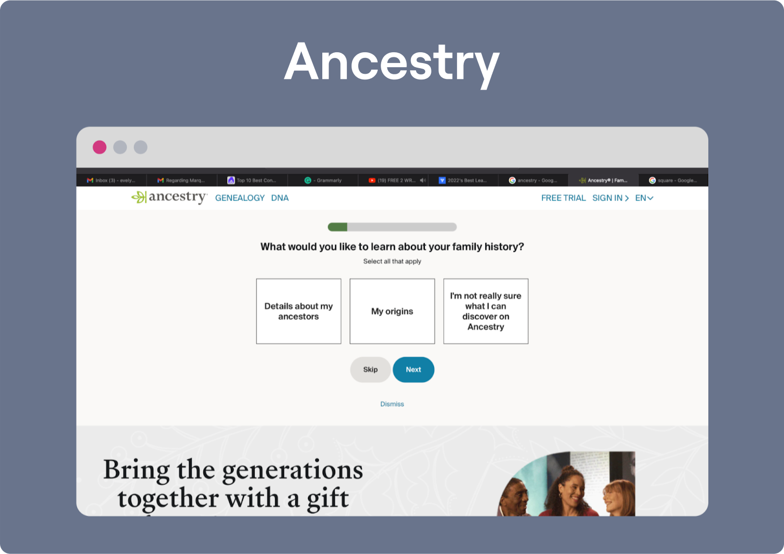
This is when Ancestry comes on to offer a free trial after stating clearly that it is a paid product.
The actual lead form is in a two-step format, with an indication of which step the user is currently on, which is, of course, great practice.
Ancestry’s lead form requires only name, email address and password fields with a clear CTA on the button.

Why does it work?
Initial curiosity test creates emotional investment
Free trial removes financial barrier to entry
Progress indicators show clear path to completion
Minimal field requirements reduce abandonment
Clear step indicators provide navigational context
18. Zebra: Digital Solutions
Zebra start engaging their leads from the word ‘Go’.
Right there on the landing page, after a well-designed video on the right side of the website, Zebra starts with a short form that requires the visitor to immediately choose what matters to them.

Zebra then decides to go in-depth, explaining their business solutions, depending on the answers of the visitor to provide keen interest.
Only then does the user see a lead form that is already tailored to their specific needs. This way, Zebra can collect more leads with a lead form that is just perfect.
From the two-column format to simple, clear fields and drop-down options, Zebra makes sure the user is not experiencing any difficulty with this form.
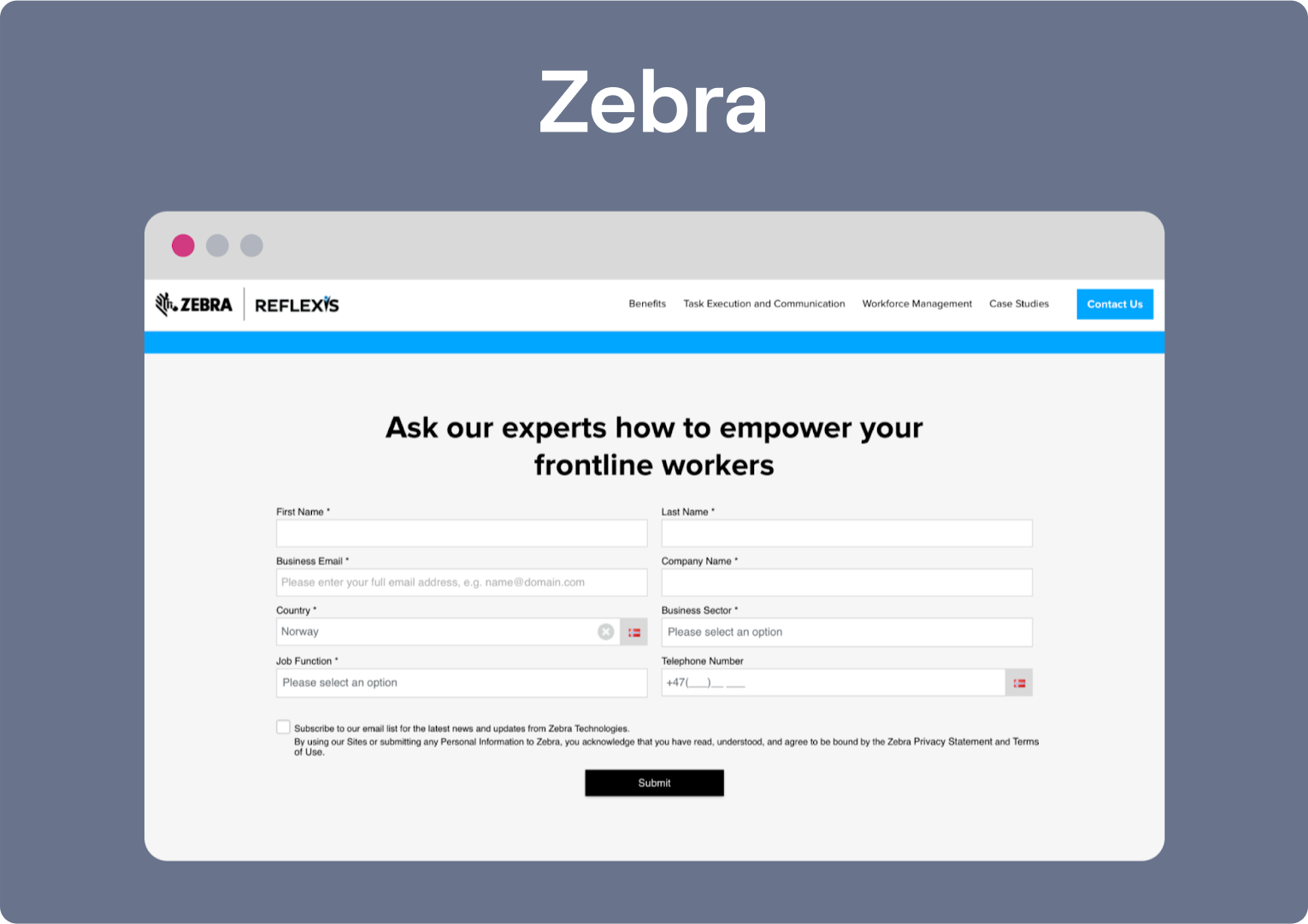
Zebra brings in traffic through B2B PPC campaigns, event sponsorships, and targeted email marketing. The lead form is dynamic and evolves based on interaction, giving it strong contextual relevance.
Why does it work?
Immediate user preference collection creates personalization
Video element builds engagement before form completion
Solution-focused approach demonstrates value first
Two-column layout reduces perceived form length
Required field indicators set clear expectations
19. Chamaileon: Email Creation Platform
As Chamaileon presents its lead form here, it does something special by simultaneously providing the user with reasons to go ahead with their decision.
They list the benefits of their product in easy-to-read points and on the right slide of the page where users can easily notice them.
Then the actual form incorporates the usual tactics for any good lead form — the necessary fields, checkboxes for marketing emails, privacy policy and of course, to prove that you are not a robot.

Chamaileon drives traffic mainly through blog content, email newsletters, and comparison sites for email builders. The form placement on the right ensures that attention stays on both the pitch and the action area without overwhelming the visitor.
Why does it work?
Side-by-side benefits listing justifies information exchange
Google sign-in option reduces friction
Robot verification builds security trust
Password confirmation prevents future access issues
Marketing opt-in respects user choice and privacy preference
20. Notion: Productivity & Workspace Tool
Notion keeps things minimal but intentional. The homepage is clean, bold, and focused on one thing — getting users to start using the product.
A sign-up form appears above the fold, offering multiple ways to join: email, Google, or Apple. No long explanations, no distractions. Just value-focused messaging and a form that’s frictionless.
Notion backs up its offer with strong social proof, listing companies like Pixar, Match Group, and Nike to build instant credibility.

Traffic is driven through a smart mix of SEO, YouTube explainers, and strong community buzz. Their lead form is placed right where interest peaks and conversion is most likely — front and center.
Why does it work?
Social proof from recognizable brands builds immediate trust
Multiple signup options (email, Google, Apple) reduce friction
Minimalist design eliminates decision fatigue
Above-the-fold placement captures maximum attention
Value-focused messaging addresses user needs directly
What Else Works to Increase Website Conversion?
Lead forms are great — no doubt. But if you're ready to go beyond static forms and tap into something more dynamic, quizzes are where things get exciting.
Interactive quiz funnels are one of the most underrated tools in lead generation. Why? Because they don’t just collect emails — they engage, qualify, and convert visitors by guiding them through a personalized experience. It feels less like filling a form and more like solving a mini problem or answering an engaging question.
That’s exactly what we do at Marquiz.io — our quiz builder helps businesses create interactive lead gen experiences that users actually enjoy. And the results speak for themselves.

You can customize your own lead capture form, generate it with AI, or use a pre-made template
One example comes from an online HR training company targeting audiences in India and the U.S. They used a quiz titled “Receive Your HR Career Development Plan!” to help visitors discover which course best fit their goals and experience.
This simple shift turned their lead funnel into a tailored experience — and it worked. In just three months, they generated over 700 leads with a 36% conversion rate, far surpassing what they had achieved with static forms.
Another case is StepFuture, an international online chess school for children. To grow their student base, they added two types of quizzes: a pop-up offering a discount and a quiz-based landing page tied to free trial sign-ups.
Both formats asked a few friendly, relevant questions — like the child’s age and interest in chess — to help parents find the right fit.
These tweaks made a big difference: they saw a 15% increase in clients from the pop-up alone and a 30% boost from the landing page.
Both brands made quizzes part of the journey. It’s smart, it’s simple, and it works.
Conclusion
From clean landing pages to smart pop-ups and streamlined forms, these 20 lead generation website examples show just how effective a well-placed lead magnet can be.
But if there’s one thing to take away, it’s this: quizzes work — really well. They don’t just collect leads, they qualify and engage them, making them perfect for the top and middle of your funnel.
So don’t sleep on it. Try out our top-of-the-league quiz builder and start engaging high-quality leads without blowing your budget. We’ll meet you right where you are — and help you grow from there.


.jpg)


